Patient Forms Experience
I was the main designer for this project Fall 2023. My team consisted of 2 designers, 3 developers and 1 product manager. My tasks were to validate project requirements, conduct user testing, UI/UX design, and presenting designs to executive leadership.
Issues Caused by Incomplete Forms
Our clients were experiencing issues with the accuracy and completion of their client intake forms. We conducted a heuristic analysis of the experience and identified some issues that cause drop off and user pain points.
The Company
HenryScheinOne
My Role
Senior UX Designer
User Research
HenryScheinOne
My Role
Senior UX Designer
User Research
The Problem
Our clients have been communicating to us that their patient’s intake forms are incomplete or incorrect 70% of the time when patients come in. This costs the dental practice time and resources by delaying the start of the visit.
My team was tasked with finding a solution for this issue.
Validation
A high ticket client informed us of the need for a mobile first approach. We wanted to validate this need by interviewing other practices that use our forms product.
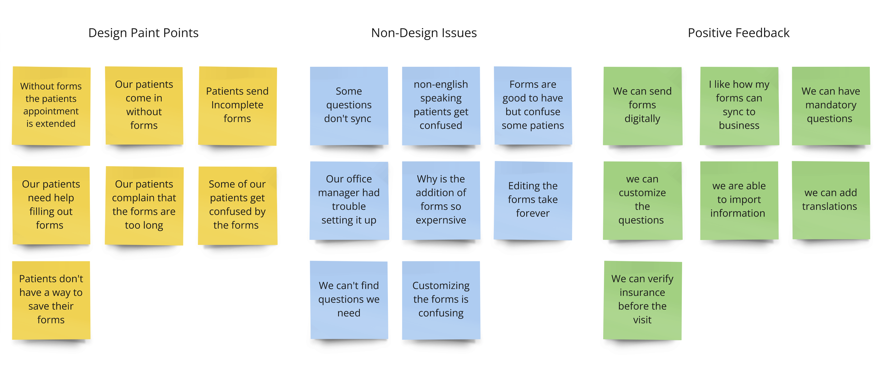
Heuristic Analysis Findings
Minimal and Aesthetic Design
The design of the forms seemed more of an afterthought. We noticed that the navigation and status bar is almost unusable since you are not able to see the page headers.
Error Prevention & Recovery
When there are errors on the page the used has to scroll through the inputs which requires the users to look for the errors.
Flexibility and Efficiency of use
Users are not able to save their forms and return at a later time. The forms require users to enter multiple types of information that requires them to gather documents and leave the experience.
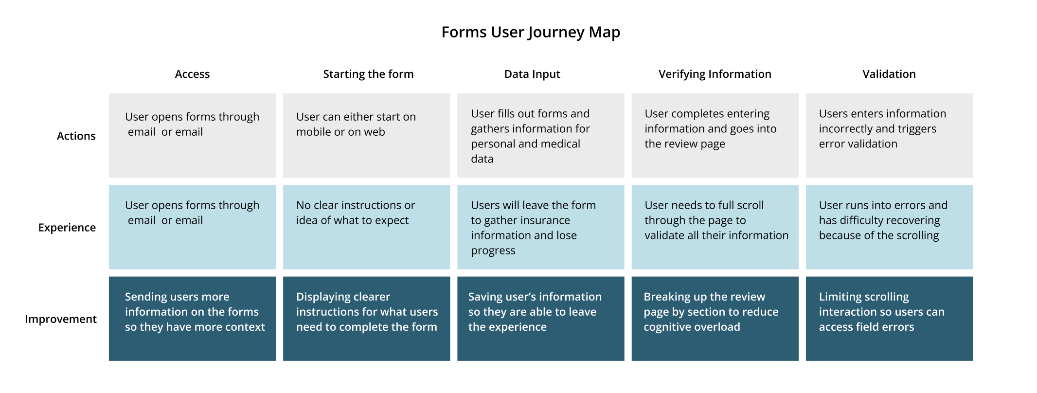
The Design Process
Exploration
Extensive issues in the experience required us to refine and identify which issues would be the least effort and maximum impact.
Defining a solution
The main things we wanted to tackle were the drop off rate and ease of use by allowing users to leave the experience and by re-designing the navigation.
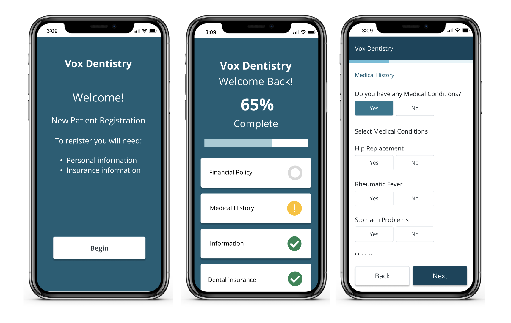
Low Fidelity Designs and Testing
We tested 10 patients from the dental practices to go through our prototype to get initial feedback and identify any issues.
High Fidelity Prototype
After validating the issues and pivoting our designs. We created a High fidelity prototype and recruited 10 more users to test our protoype.
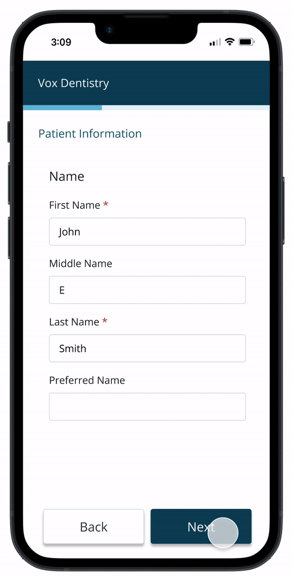
Features
- CTA with larger touch points
- Reduced scrolling interaction
- Pendo data tracking
- Form tokenization
Prototype
Delivery and Launch
There were some database technical limitations that required us to make a V1 of the forms on the way to creating our final design.
V1: Our aim was to limit scrolling since this causes issues with validation. The developers informed us that the personal information needed to be on one page because of the data service calls. For V1 we decided to keep the personal information on one page allowing for some scrolling interaction.
Low Fidelity Designs and Testing
We tested 10 patients from the dental practices to go through our prototype to get initial feedback and identify any issues.
High Fidelity Prototype
After validating the issues and pivoting our designs. We created a High fidelity prototype and recruited 10 more users to test our protoype.
Results and Reflection
After the product was launched we checked our data and feedback after 3 months.
We were able to achieve a 30% drop off rate which is a 50% reduction.
We tracked our NPS score and received 4.2 out of 5 which shows that the users that did complete the survey found it easy to use.
We would ideally be able to create a profile for the patients in the near future, but tokenization works for now.
Being more careful and thoughtful with the designs of a Legacy Product would help us design better experiences in the future.